I hope, and I predict, that we’ll start to see more of a trend in web and software development in the coming months and years that probably already has a great name, but since I don’t know it, for now I’m giving it my own name: context-aware design.
Loosely, I define context-aware design as a principle where an interface offers up specific information geared to that particular unique situation — either some customized data, navigation, or other existing element that’s loaded up at just the right time when it might benefit the user most.
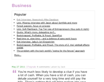
I noticed a subtle but great example of it today when looking for a post on 37signals’ blog Signals vs. Noise. It was hidden in an often-overlooked and under-designed area that most blogs have: category archive pages. On Signals vs. Noise, if you click a category archive link (“Business”, in this example), you don’t just see what you’d expect from most blogs: the typical reverse-chronological list of blog posts from the Business category. Instead, you’re greeted with a nice bit of context-aware design right at the top of the screen:

See the “Popular” box at the top right under the page title? It’s a simple concept: For folks browsing that category, why not show them the 10 most popular posts, right off the bat? If they’re deep diving for a particular item or topic (rather than searching), there’s a good chance one of the popular posts is the one they’re looking for — and if they’re just perusing, showing the most popular posts is a simple but effective approach to showing what types of content are in that category.
The “Popular” box shows off what makes context-aware design such a benefit for both developers and users: It’s simple to implement — most blog software will readily serve up popular content in a widget — and it’s the type of spontaneous experience that creates and builds trust. It adds up to less cost and more time spent with the interface.


Leave a Reply